Winsor & Newton Cotman Watercolour Metallics
The Winsor & Newton Cotman watercolour series ‘metallics’, includes Yellow Gold, Silver, Pewter, Red Copper, Iridescent Black, Blue and White.
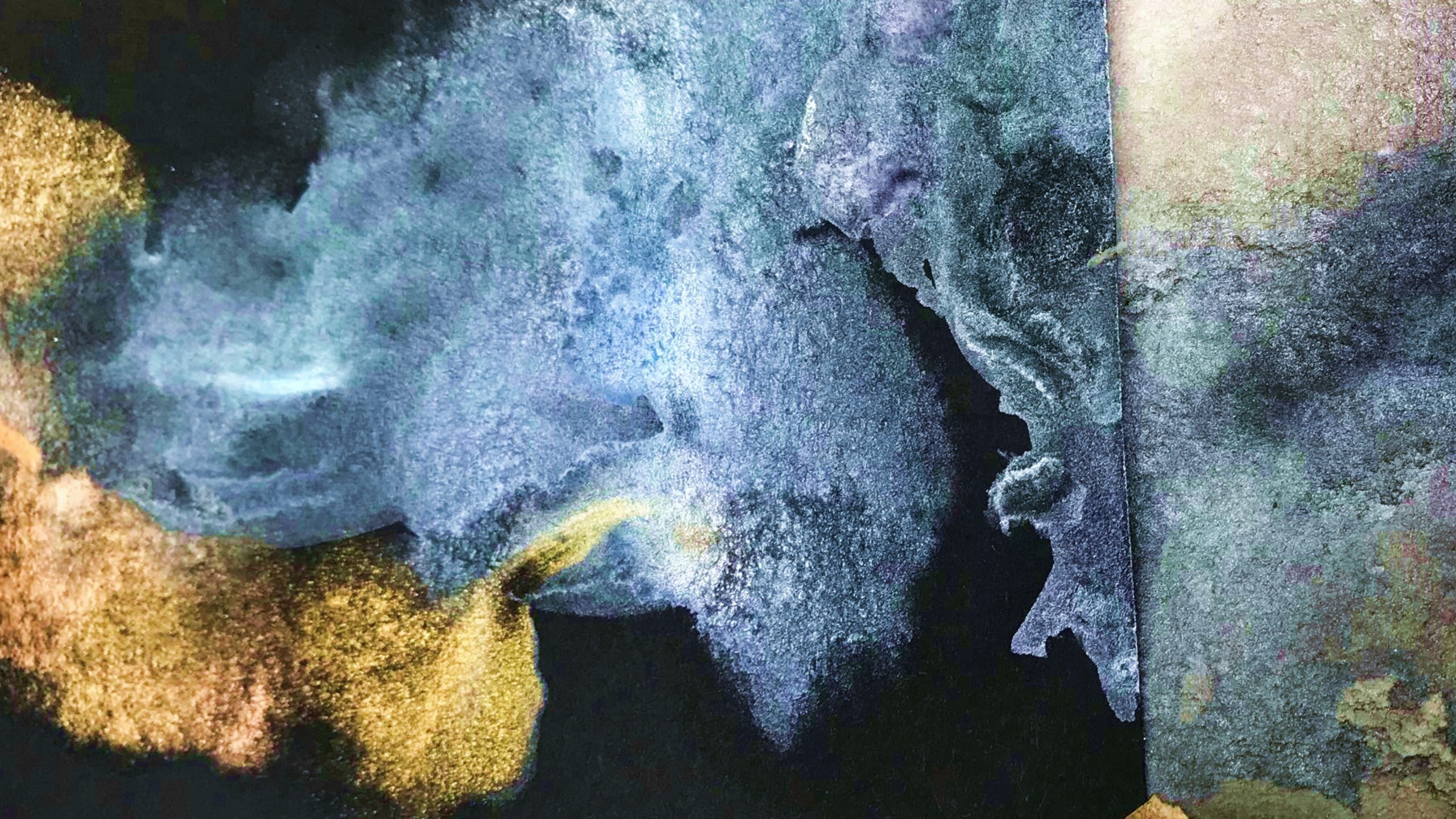
These pigments are coated with a variety of different mica ores, which, when bound into the paint, have a lustrous, silky, pearl-like finish when dry. Each colour in the metallic series creates this shimmering effect.
Even thin washes dry with individual micro-particles of mica which sit on the surface of the paper reflecting ambient light. This is an unusual effect for watercolour, which normally dries matt. Even when granulation occurs with traditional pigment washes, they do not normally ‘twinkle’.
Blue and white Cotman metallics are transparent, but all the others are semi-opaque, and if applied thickly can obscure layers underneath. Thicker layers of applied paint, and a build-up of washes, appear as if lacquered. The tonal colour of this metallic paint changes when seen from different viewpoints. As the source of ambient light shifts as we move, so the tonal colour changes.
When applied with minimal addition of water, Yellow Gold gives an impression similar to Gold ground. Gold ground is the result of real gold leaf applied across areas of the prepared wooden panel.
Each of the Cotman watercolour ‘metallics’, can simulate the effects of gold leaf, silver leaf and copper leaf, but with the speed and convenience of watercolour on paper.
Tubes and pans are labelled as Permanence A and are lightfast. This indicates that these paints have been laboratory tested with machines that accelerate the effects of ultraviolet light over hundreds of years. Given the Permanence A rating, they have excellent resistance to fading and tarnishing.
Mica, like Gold, is an inert metal, and therefore doesn’t degrade when exposed to sunlight. Gold, a precious metal, is immutable, unchanging and incorruptible over time. Much of the symbolism of gold to be found throughout art history derives from this perennial incorruptible property. And gold’s incorruptibility gives it a celestial/spiritual everlasting symbolism - the common example being a halo – a metaphysical idea of sanctity made physical with gold leaf in paintings containing religious iconography. Gold represents authority, sacred power and prosperity and is used most effectively to facilitate devotion towards a subject. It raises a subject above the everyday, and gives rise to reverence.
GOLD & SILVER
Gold - The Wilton Diptych. National Gallery, London.1395-99
The Wilton Diptych was commissioned for Richard II, King of England, in the last five years of his life.
It is a hinged portable altarpiece in two parts, measuring 53 x 37 centimetres when open. Painted in egg tempera on oak, approximately half the total surface area is gold ground. A composition dominated by the juxtaposition of ultramarine blue and gold is breathtaking.
The interior left hand panel shows a kneeling King Richard, surrounded by patron saints and John the Baptist. The right hand panel shows the Christ child, held by the Virgin Mary in blue robes. They are attended by a host of winged angels also clad in blue robes. Richard is being presented to Mary and Jesus by John the Baptist, whose right hand ushers him forward. Mary looks directly into King Richard’s eyes, and he hers.
It depicts King Richard being presented with the flag of St. George. Richard’s outstretched hands are about to receive the standard from an angel, as Christ blesses the flag.
This altarpiece shows a direct relationship between the King of England and the Queen of Heaven. It personifies the medieval belief in the divine right of Kings.
Divine right proposed that Kings were preordained to rule by God, and that they were not accountable for their actions to any earthly authority.
Given that this altarpiece was commissioned for King Richard’s private worship, the Wilton diptych is the embodiment of Richard’s belief in his own divinity.
The exterior of the altarpiece is painted with a white stag, Richard II’s emblem. Each angel painted inside, is wearing a brooch depicting a white stag. The interplay of exterior and interior, of open and closed, and of temporal and spiritual is highly sophisticated. Much of the spiritual and devotional function of this artefact is achieved by Gold ground and tooled gold pattern.
Silver - Andy Warhol
Andy Warhol became a highly successful commercial graphic artist in New York in the late 1940s. He was well known as a shoe designer. In some of his designs, Dutch leaf and silver leaf were collaged with ink sketches, enhancing their decorative opulence as footwear.
Gold and Silver shoe of 1955, is comprised almost entirely of filigree silver foil. Foliage, flowers, birds, hearts and bows are interwoven to create the body of the shoe. Each motif is made from silver foil. It wouldn’t have looked out of place at the court of Louis XIV in Versailles.
A year later with ‘Golden Shoe (Julie Andrews shoe)’ of 1956, Warhol draws an equivalence between a movie star (Julie Andrews- from My Fair Lady) and his shoe design.
This gravitation towards celebrity, graphic design and acquisitive consumer culture predates his career as a pop artist.
By 1962 he was famous for ‘paintings’ on a grand scale representing the fecundity of post war American product design. Warhol appropriated the advertising of industrial mass production and photo journalism, and re-presented it within the context of galleries and museums as ‘high’ art.
Huge brightly coloured grid-like canvases of Campbell’s soup cans, Coca-Cola bottles and the like, mirrored both supermarket shelving and satirically, the size of abstract expressionist canvases. Repetition of the same image using silk screen, echoed modern industrial production, and in a sense, undermined the ‘uniqueness’ of an artist’s brush stroke – and its association with the New York School.
Repetition has an ambiguity in Warhol’s painting. Does repetition imply the dilution of an image’s power through over-exposure to it? Or does it point to an obsession with that same image? – Quite the opposite.
In Warhol’s Death and Disaster series have begun in 1962 with ‘129 Die in Jet’, he returns to silver as a colour. But this time, its use as adornment is upended.
The Death and Disaster series uses appropriated photographs. It re-deploys photojournalism, movie film stills and Hollywood press photography. Is it a reference to the silver screen?
Some of the photojournalistic images were considered too distressing for public consumption, and censored by newspaper editors. Warhol somehow managed to get hold of them and turned some into huge canvases.
The most famous is ‘Silver Car Crash (Double Disaster)’ 1963, an enormous diptych measuring 8’ x 13’ in two equal parts. The left hand panel shows a slumped driver next to the steering wheel of a mangled car. The crashed car and occupant are printed in black on a silver ground and repeated 15 times into a grid. The right hand panel, painted entirely in silver is blank and could be read as a void. When reading a book or cartoon we read from left to right. Therefore, in this work, the silver ‘void’ comes after the image of death and disaster.
Warhol was a devout Catholic, attending church every day. This was not known except by his closest friends until after his death. Could the blank silver canvas of the right hand panel symbolise the dread of an existential void?
Like Gold ground, silver is mainly used in the Death and Disaster series as a background colour onto which black acrylic paint and ink are screen printed. The black paint on a silver ground is a well matched simulation of the black and white printed imagery of newspapers and magazines in the late 1950’s and early 1960’s.
The significant difference is that the paintings are enormous when compared with a photo printed in a newspaper. And in some cases, Warhol makes the images visible, when formerly censored, and not for public consumption. In a sense, this is a kind of unmasking.
Warhol’s Death and Disaster paintings are the flip side to his chronicling of Americana and the bright flat colours of adverting and the American dream.
The silver, with its grey colour, lends these images a sombre gravitas, alongside certain chilling voyeurism. Others with silver grounds include, ‘Suicide (Silver Jumping Man) 1962-3, ‘Double Elvis’ 1963, Silver Liz 1963, and ‘Tunafish Disaster’ 1963.
In conclusion
Cotman metallic watercolours provide a remarkably convenient simulation of metal leaf which can be painted as part of a decorative composition.
They can also have a broader application and symbolism if desirable.
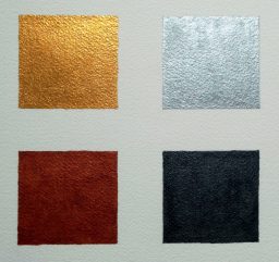
Top L: Yellow Gold. Top R: Silver
Bottom L: Copper. Bottom R: Iridescent Black
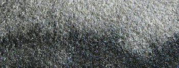
Close up of Iridescent Black wash, showing speckles of mica as tiny silver dots.