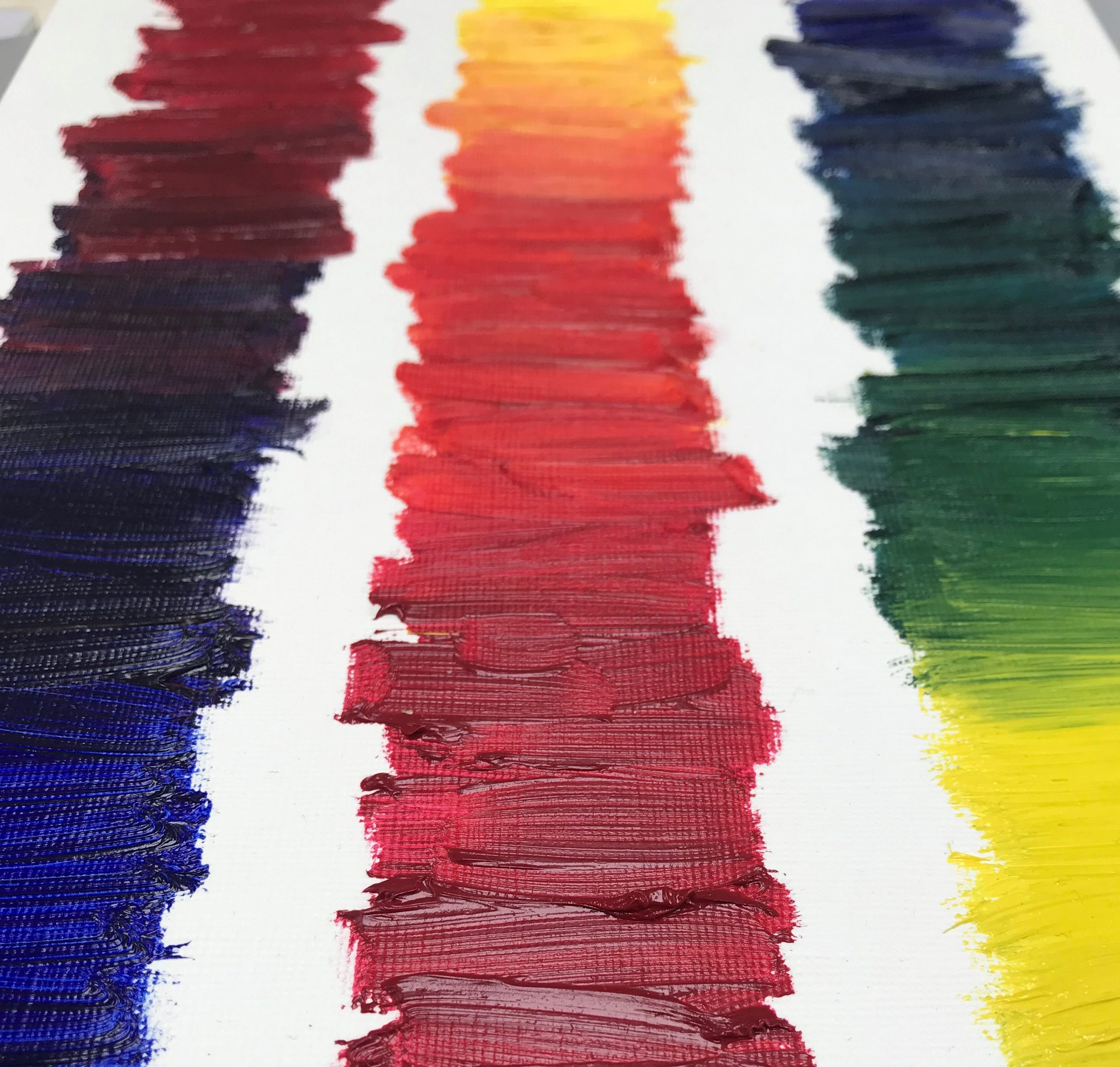
Primary Colour in Painting by Simon Willems

Primary colour in painting tends to be synonymous with a core of modernist masters. Whether Piet Mondrian, Wassily Kandinsky, Sonia Delaunay or Kasimir Malevich first spring to mind is neither here nor there when an image of pure saturated colour is what matters.
To think about primary colour is to think about the role of cadmium red, french ultramarine and cadmium yellow in Mondrian’s Broadway Boogie Woogie or chrome yellow, vermillion and cobalt blue in Malevich’s Suprematist Painting (with Black Trapezium and Red Square). This does not mean, of course, that ‘red’, ‘yellow’ and ‘blue’ are the sole anchor points. We know, for example, how red, green and blue underpin everything in the RGB model of colour mixing, discovered in the early days of photography, in which the overlapping of these three colour filters creates the whole spectrum. And likewise, we know that cyan, magenta and yellow fuel all colour coding in the CYMK profile of mixing, used in digital and offset printing processes.
While these models reflect developments in photographic and printing technology respectively, more than they do anything else, they also reveal the tricky nature of defining what one means by primary colour. And yet, another way to think about this, at least as it relates to primary colour in painting and the visual arts, is to think about how it is thematised. This does not have to be met simply at the level of how pure colour finds its way into a painting; in how red, yellow and blue, or whatever, are clinically deployed and composed as saturated elements, when each primary colour generates tertiary and earth variations of hue by extension. So one can look at a painting that would normally elude such analysis and think about how it is designed around primary colour, whilst appreciating how each colour is afforded scope through different registers.
In Nicolas Poussin’s ‘Et in Arcadia Ego’ for example, one is immediately aware of the triangle of gold, prussian blue and vermillion marking out the togas that the figures gathered around the tomb are wearing. One is similarly aware of how this primary-themed gesture frames the composition, functioning as an index for how red, yellow and blue take embedded effect elsewhere in the picture through different tones in the modelling of form. And if one looks at a less obvious example, such as Ford Maddox Brown’s The Pretty Baa-Lambs, one can see how the rose coloured bag at the heart of the canvas satisfies red, harmonising with the ground and the sky in these terms.
One can see, even as other reds and other blues and so forth come to the fore, how the cobalt blue sky that floods the upper half of the painting, sits in counterpoint to the lip of yellow ochre that holds up the bottom right-hand corner. It’s not that other colours do not play their role – and the significance of green in this painting should not be underestimated as it swings between emerald and oxide of chromium – it’s just that the piece relies on a logic of red-yellow-blue to function, and in so doing champions yellow this time as earth.

