Painting and Colour by Chris Daniels

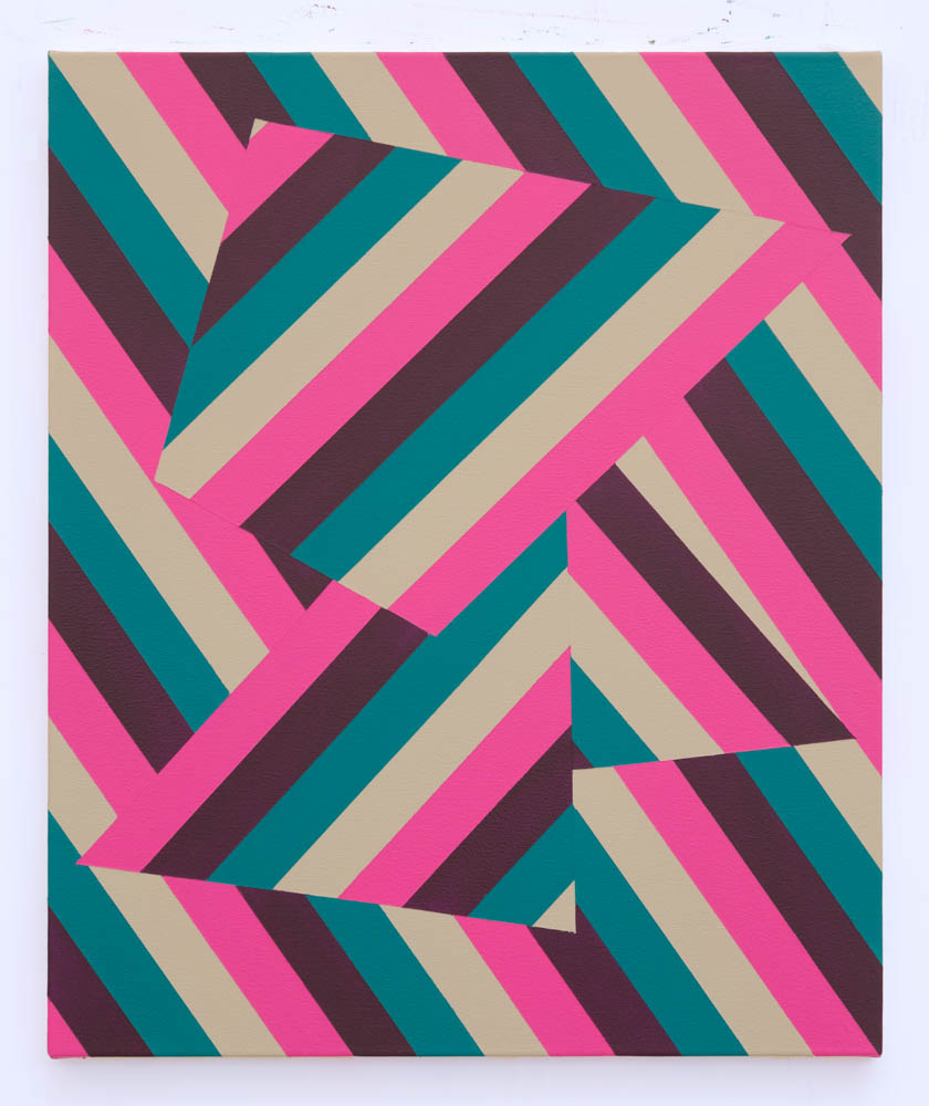
*Chris Daniels Lineae XIV
In a passage of John Gage’s book Colour and Culture: Practice and Meaning from Antiquity to Abstraction, the story is retold of how the Impressionists were labelled ‘Eclatistes’ or (‘Dazzlers’) by Vibert for ‘painting only the intense colours and without shading any of the tones’. This has always struck me to be a statement that would seem to be a positive, conceptual approach to colour in contemporary art and illustrates how the validity of an artist’s use of colour has evolved over the last 120 years.
Through changing styles and technology, colour has risen in the hierarchy of artistic components from merely a reflection of reality to a conceptual function. Despite a history of bright colour use by Ancient civilisations, the use of colour became regarded as a secondary skill, dismissed and belittled. ‘Colourists’ was used as a derogatory term, and as noted by David Batchelor in his introduction to Colour, the use of colour ‘has often been regarded as superficial, supplementary and cosmetic’. But as the ideal of representation became less important and abstraction developed, the use of colour has come to the forefront. Artists have pursued intuitive, personal and non-academic approaches to colour to dramatic effects, aided by advances in technology.
There was always a strict, academic attitude to colour theory in the Salon approved style, yet the Impressionists sought to capture the outdoor light depicted in their painting, using more intense contrasts to illustrate the emotive scenery. The focus moved from composition and drawing to light and colour. This provoked a backlash from the establishment, but the popularity of the movement ensured that the hierarchy would not be reversed.
Mondrian and the De Stijl artists pushed the conceptual status of colour further. As the work becomes more reductive and uncluttered, form and colour remained at the forefront. They brought rationality to the artists’ aesthetic principle by creating structures so the colour could be applied without adherence to the object itself. Mondrian himself painted only with primary colours (red, yellow and blue) within his black and white structures after 1921.
Mondrian’s ‘extremist’ notion led him to abstraction, and this was built on by the ‘Colour Field Painting’ artists including Rothko, Frankenthaler and Louis. The 1950’s were an apogee of colour experimentation, aided by the invention of Magna and Acrylic paints, pigment and colour were now the key components of painting, exemplified by the Colour Field artists. This period firmly established colour’s independent status from drawing. Excessive gesture and imagery were eliminated, leaving reduced forms and colour combinations. This was further distilled by Ellsworth Kelly, producing intense, brightly coloured forms often derived from external sources, using in his own terms ‘colour at its full intensity’. In his ‘Statement for Colour” in 2007, Kelly made his valuation of colour clear, stating ‘Colour plus form is the content’.
It is impossible to discuss colour without including Josef Albers, both as an artist and an educator. His seminal book ‘Interaction of Colour’ is a teaching resource for teachers and students and illustrates Albers personal approach to colour through experience. Stating Albers belief that colour is in a continuous flux, and how it can only be understood in relation to its surrounding colours, Albers recognises two elements of colour, ‘Brightness’ and ‘Lightness’ and this is demonstrated in a series of optical illusions and exercises. Through his ‘Homage to the Square’ series, Albers preferred readymade, straight from the tube colours, using colour as the primary focus over form. Albers produced over two thousand works in this series, the fixed structure set the template for unleashing different colour investigations. The relation of colour was the subject of this series, and it occupied Albers for over 25 years.
A further use of colour is as a concept, seen in Maria Lalic’s ‘History Paintings’ series, which shows how the availability of colour has accelerated over the centuries. Using a chart found in 1994 with a list of pigments separated into the availability of a certain era, i.e. ‘Cave’, ‘Egyptian’, ‘Greek’. Lalic painted all the colours listed in layers to create a chromatic portrait of the time period. Lalic sums up her interest in history of pigments as ‘I think I’m simply excited by recognising a time and place through colour’. The recent eras consist of more colours, and this signals the availability of a much wider range of pigments at affordable prices, allowing the contemporary artist to consider a vast array of colours in all media. It has never been easier to access the mysteries of colour.
Links
- https://books.google.co.uk/books?id=oq_GtjmoTNgC&pg=PA223&lpg=PA223&dq=eclatistes&source=bl&ots=ZpDQ9TQ2Ww&sig=ACfU3U0qFSkb9WZW0xCDykanLqv5JXLjwg&hl=en&sa=X&ved=2ahUKEwjP7fu8uMHuAhWmaRUIHQ4wAisQ6AEwAHoECAYQAg#v=onepage&q=eclatistes&f=false
- https://www.davidbatchelor.co.uk/books/colour/
- https://www.tate.org.uk/tate-etc/issue-16-summer-2009/sixty-years-full-intensity
- http://morrislouis.org
- https://www.tate.org.uk/art/artworks/lalic-history-painting-17-italian-naples-yellow-t07290

