Cadmium and Lemon Yellows by Steve Johnson
There are three primary colours, red, yellow and blue. Red is the warmest; blue is the coolest.
From these three primaries, all other possible colours can be mixed.
Colours for Fine Art painting are made from pigment mixed with a binding medium, and pigments are divided into two main groupings, warm and cool.
Warm colours have a greater proportion of red in them, cool colours a greater proportion of blue.
Cadmium Yellow is in the warm category because it has a reddish tinge and Lemon Yellow is cooler because it has a bluer tinge. Cadmium Yellow is a particularly opaque and powerfully saturated pigment.
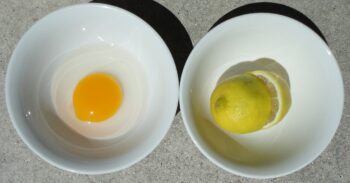
To compare and contrast yellows in nature is a good way of understanding the differences, and to provide a definition of the various optical attributes. An observable everyday comparison here would be the difference between an egg yolk with its orange tinge (Cadmium Yellow) and a freshly picked lemon fruit with its greenish tinge (Lemon Yellow).
From an elemental, chemical perspective, Cadmium is a zinc ore, and metallic Cadmium was not discovered until 1817. The yellow pigment was discovered by producing Cadmium Sulphide (Cadmium Yellow).
The properties of its chemistry make Cadmium Yellow the densest and most opaque yellow, with excellent ‘hiding’ properties, meaning over-painting qualities that effectively cover up the colour underneath it. It is lightfast and exhibits superb permanence. Cadmium Yellow is classified as ‘absolutely permanent’. The exception to this property is for exterior use in murals.
Due to the relatively late discovery of Cadmium Sulphide, Cadmium Yellow will not to be seen or detected in Old Master paintings.
The influence of Cadmium pigments after their discovery is undeniable. They were highly influential on 19th-century painting, in particular, the development of Impressionism. It is the brilliance and opacity of these pigments and the success with which they can be used to over-paint that opened the door for new painterly techniques and new creative visions in the late 19th and 20th centuries. Over-painting allows for immediacy and therefore, spontaneity.
Innovations in plein air painting – the recording of transient light effects painted directly and spontaneously outdoors in the landscape, were facilitated by over-painting. And the saturated flat colour compositions of Modernist Abstraction are synonymous with, and arguably facilitated by, the arrival of the Cadmium based pigments with their densely pigmented opacity. The retinal ‘punch’ and intensity of Cadmium pigments have been harnessed by Modernist abstract painters, for their assertive ‘presence’ in the room/gallery.
Traditional Chiaroscuro, the balance of light and shade in a picture and the management of tonal shadows in conjunction with perspective, gives way to pure colour juxtaposition. Applied directly from the tube in ‘all over’ compositions where background and foreground are equally significant, the Impressionists exploit the opacity and brilliance of Cadmium pigments. Attention moves away from the tonal effects of Chiaroscuro. What becomes a priority is to discover what intensely coloured paint itself can do, outdoors, on a flat canvas, under the warm sun or wintery light. Until this time, painters had always worked indoors. The shadows still exist in Impressionism, but they are made with pure colour. The opacity and intensely saturated pigmentation in Cadmium pigments is perfect for the flat ‘confrontational’ style of both Impressionism and Modernist Abstraction.
CADMIUM YELLOW
Two notable examples of how Cadmium Yellow has been used to great effect in the evolution of Modernism can be seen in Piet Mondrian’s ‘Blue, White and Yellow’’1932 and Ellsworth Kelly’s, ‘Black Over Yellow’, 2015.
Piet Mondrian. ‘Blue, White and Yellow, 1932, Oil on canvas, 45 x 45 cm.
‘Blue, White and Yellow’, 1932, by Piet Mondrian is a painting where three dimensional illusion, the representation of observable reality, and the curved lines to be found in nature, have been eliminated. By the time of his evolution into an abstract painter, Mondrian particularly disliked the colour green, because it was redolent of the natural world – grass, trees, moss etc.
Mondrian was striving for a spiritual art that transcended the observable natural world. There are no straight lines in nature, so he used them exclusively, and the green tint in Lemon Yellow was undesirable.
The paintings of his mature style, which he named ‘Neo-Plasticism’, were painted exclusively in the primary colours of red, yellow and blue, on a ground of white, with each colour meticulously positioned between horizontal and vertical black lines. He chose a reduced palette and the ‘neutrals’ of white and black to achieve absolute purity in art. Red, yellow, and blue cannot be produced by a mixture of other colours; so in Mondrian’s mind they are indivisible and have the ‘purity’ of prime numbers.
In an essay on Neo-Plasticism he wrote ‘’ As a representation of the human mind………….this new plastic idea will ignore the particulars of appearance, that is to say, natural form and colour……………it should find expression in the abstraction of form and colour…………..in the straight line and the clearly defined primary colour’’.
It is significant that his works from this period are seldom titled, except for what they are, a composition made with primary colours. They are reduced to what the essence of painting is in a literal sense, paint on canvas. Even titles become irrelevant. They are not narrative paintings with a back-story, a biblical allegory, a moral education or a political message. They do not embody or try to project symbolic meaning, so persisting with titles would be misleading and pointless.
Mondrian’s paintings are not a picture of something else; they have a presence all their own, with their own distinct visual language. ‘Blue, White and Yellow’, 1932, is not a serene view under a perfectly cloudless blue sky. But the linear design and the balance of each area of distinct rectangular primary colour is in itself perfectly stable and serene. The painting itself constructs a perfect calm. ‘Blue, White and Yellow’, 1932, is the concretisation of stillness in an abstract painting that we can reach out and touch.
It produces a calming effect in the viewer and slows one down in the looking. It stops you in your tracks with its disarming simplicity. His works communicate this harmony by specifically using only straight line and primary colour.
Although the paintings are made by Mondrian, they are not about him. They are not anecdotal. The painted colour is laid down as a flat layer without the usual ‘signature’ brush stroke of an individual. Ego is put to one side. They are beyond emotion and political ideology. Paint handling and mark making does not draw our attention away from the purity of colour. Paint handling is intentionally anonymous. This adds to Mondrian’s universality.
Ellsworth Kelly. ‘Black Over Yellow’, 2015, Oil on canvas, 229 x 178 cms.
In ‘Black Over Yellow’, 2015, Ellsworth Kelly pushes the concept of non-representation to its limits. The attention of a viewer is directed to the contemplation of colour and concrete form exclusively. We are in the presence of Cadmium Yellow and black. The ‘object quality’ of painting (as opposed to its capacity for illusionism and perspective) is given absolute priority.
One way Kelly achieves this is to break away from the traditional rectangular format of the painted canvas. Conventionally, canvasses are rectangular to echo the idea of a window through which we view a scene – the scene painted by the artist. (Mondrian was still painting rectangular canvasses in 1932).
In making two distinct canvasses of different sizes in ‘Black Over Yellow’, 2015, and by butting the two canvasses up against each other, the window effect is avoided. The black and the yellow pigments are given a near sculptural/physical presence. The ‘Plasticism’ that Mondrian envisaged is fully realised. It isn’t sculpture in the round, but sculptural through 180 degrees installed on a wall.
Black is given physicality above Yellow light. In terms of the physical sciences, black is not a colour because it absorbs all light from the colour spectrum and reflects none back into the eye.
Kelly is stacking black on top of yellow. He is balancing a lightless void on top of a warm Cadmium Yellow light. The piece is installed with a gap of 5 centimetres away from the wall. This asserts the 3 dimensional constructive nature of the piece when inspected close to at the edges. But paradoxically, this 5 centimetre gap gives an appearance of floating bands of light and dark when viewed frontally at a distance in the gallery. In its reductive approach (there are no drawn lines on the canvas) and in its rejection of the single rectangle (this is not a window), his works are an ultimate challenge to representational painting and illusionism.
Nonetheless, ‘Black Over Yellow’, 2015, embodies an essence of the Sublime which so inspired the Romantic artists of the 19th century.
In 1757 the philosopher Edmund Burke in his treatise on the Sublime and the Beautiful wrote, ‘Whatever is any sort terrible or is conversant about terrible objects or operates in a manner analogous to terror, is a source of the sublime’.
His theories had a significant influence on Romantic painters and poets – notably JMW Turner’s paintings of storms at sea and in particular Caspar David Friedrich’s ‘Monk by the Sea’, 1808-10. This painting in particular was much admired by Mark Rothko.
William Wordsworth, best loved of all English Romantic poets, was inspired by the light from yellow wild flowers along a lakeside, ‘A host of golden daffodils’ as he called them. His most famous poem, ‘I Wandered Lonely as a Cloud’, of 1804, is a poem about the restorative powers of beauty in nature and the transience of spring, forever stored in memory and the mind’s eye.
In the vertical juxtaposition of ‘Black Over Yellow’, 2015, Kelly’s painting effectively becomes a field of dark over light. This in turn evokes ideas of the Sublime, but Kelly is not depicting it as a scene, it is with us in the gallery.
‘Black Over Yellow’, 2015 was painted in the year of Ellsworth Kelly’s death at the age of 92. His appreciation of the beauty of light and his awareness of its coming to an end must have been acute.
The timing of this work’s completion gives the work an existential gravitas and a heroic grandeur. Is that black canvas stacked on top of a yellow canvas analogous to the terror described in Burke’s theory of the sublime and the beautiful? The lower section of Kelly’s painting is the most beautiful of yellows.
Is that black section analogous to a gathering storm or an eclipse of that most beautiful of yellow?
Two notable examples of how Lemon Yellow has been used in the 20th Century are ‘Nighthawks’ 1942, by Edward Hopper, and ‘Weeping Woman’ 26th October 1937 by Pablo Picasso.
LEMON YELLOW
Edward Hopper. ‘Nighthawks’, 1942, Oil on canvas, 84 x 152 cms.
‘Nighthawks’, 1942, is one of the most famous and most reproduced figurative paintings of 20th century American art. It is a picture of a soda bar, Phillies, on Greenwich Avenue where two streets meet.
The soda bar is a bubble of Fluorescent light, hermetically sealed within a glass frontage. There is no door. It is late at night.
The rooms above the shops on the other side of the street could be store-rooms, or contain people already asleep. The bar’s interior is the only source of light illuminating the whole scene, interior and exterior. There are no street lights in view. The lights of the bar are not visible either, they are cropped, unpainted, and out of sight.
The light source, although unseen, is very bright and radiates from the bar’s lemon yellow walls. The light source for the whole picture is reflected from them. This light is almost blindingly bright.
The acidic nature of lemon yellow intensifies this. As a result, the cosy interior is not as intimate as it could be. The customers are exposed, so much so, that the peaks of the men’s hats, still being worn, create some relief from the glare. They are also exposed to our gaze.
The bar’s pane glass corner frontage acts as a framing device within the frame of the canvas. The windows act as a frame within a frame, concentrating our attention on the customers and the bartender.
Depending on which colour model is used, the complementary colour opposite yellow is either blue or purple. The window behind the smoking man and the woman wearing a red dress is painted totally in shades of blue and purple. The wall surrounding this window and framing it is lemon yellow.
Hopper is using the juxtaposition of yellow and blue/purple to set up an extreme optical contrast of opposites. Hopper is using them to heighten through coloured paint the other opposites of day and night, light and dark, inside and outside.
This window is a complete graphic construct. The view through it to the shop over the road is rendered in shades of blue and purple. The shop next door to it is painted with brown interior shelving and a green facade. The device is not an observable reality at all. It’s a theatrical invention, but at the same time utterly believable.*
The man on the left with his back to us looks to be staring into his glass. He seems lost in thought. The smoking man and the woman in the red dress seem intimate by their proximity to one another. The barman, also wearing a hat (although more jaunty than the others), appears to be passing some comment to the smoker. The woman is both present and detached, intent on something in her hand. She’s listening, but thinking of something or someone else.
The simple reading of the painting is that it’s a group of three people who don’t want to leave and enter that dark night, but the barman who appears less pensive, might want to end his shift and go home.
The whole mystery of the internal thoughts of the diners invites projection from us as viewers, and possible scenarios about who they are, and what they might do next. The man with his back to us may be heading back to an empty room. The smoker and the redhead in the red dress may end up somewhere more private. The bartender might just go through the mustard coloured door behind him because he lives above the bar. Who knows?
The painting is in one sense an image of urban solitude – although Hopper denies it was the content he was intending to portray.
However, with more certainty, we can say he has constructed our viewing position quite deliberately. Where we the visitor in the gallery, or reader of an art book, or online spectator look at ‘Nighthawks’, we are looking at it from a lonely vantage point. Hopper positions us outside on the street, where it’s dark, looking into, but excluded from, the light. There is no door into which we could enter the light. He is making us, the viewer, an outsider, on the other side of the glass frontage looking in. Some might say he has cast us as a voyeur, which in a sense is another position of remoteness.
An empty glass on the counter nearest to us indicates that someone has just left.
It would be difficult to ignore the timing of the painting’s inception with world events. Who were they, and where have they gone?
Japanese aircraft destroyed the US Pacific fleet on December 7th 1941, and America entered World War II the next day. Nighthawks was begun in the weeks after the outbreak of war and completed soon afterwards. The Art Institute of Chicago bought it for their collection in May 1942.
The world outside that bubble of light, on a familiar street corner, is at war.
It may account for the pensive silence inside and outside Phillies.
Pablo Picasso. ‘Weeping Woman,’ Oil on canvas, Oct. 26th 1937, 61 x 50 cms.
Before describing the use of lemon yellow in this portrait it is important to note the historical context in which it was made.
‘Weeping Woman’ painted on October 26th 1937 is ostensibly a cubist portrait of Dora Maar, the Surrealist painter and photographer.
She had met Picasso in Paris in 1936 and they became lovers. She became his muse and intellectual companion.
Maar later said of the portrait, that it wasn’t so much a portrait of her, but more a portrait of the Spanish people.
On April 26th 1937 in support of General Franco’s Nationalist forces during the Spanish Civil War, Nazi German aircraft bombed the Basque town of Guernica. Up to an estimated 1600 civilians were killed according to Republicans. It was one of the first aerial bombings of a civilian population. Hitler, besides aiding Franco’s war efforts, was testing the Luftwaffe’s aerial capability and its effectiveness as an instrument of ‘total war’. The bombing took place on a Monday, Guernica’s market day, and it was busy with people from surrounding villages buying fresh farm produce.
Shoppers tended to dress up in their best clothes on market day.
Picasso, a supporter of the democratically elected Republicans, began his anti-war mural, ‘Guernica’, 15 days after the bombing. It was painted at his home in Paris. This enormous black and white cubist mural, depicting the effects of the bombing on the town and its inhabitants, was completed in June 1937 and measures 3.49 metres high by 7.77 metres wide.
After its completion and until October of that year, Picasso painted, drew and printed 60 works dedicated to the subject of the image of a weeping woman. All are portraits of Dora Maar.
The most famous and final painting in the series is ‘Weeping Woman’ of 26th October 1937, now in the collection of Tate Modern, London.
In the ‘Weeping Woman’ of 26th October1937, it is thought that Picasso is not painting events from the Spanish Civil directly. It is thought to be is a singular and universal image of a woman’s grief and suffering. One might draw comparison with images of the Pieta and the Madonna as she cradles Christ, her lifeless son, across her lap.
Certainly placed to the far left of the Guernica mural is the image of a screaming woman, head contorted and looking skywards, cradling her limp child.
But when considering the white and blue shape in ‘Weeping Woman’ of 26th October 1937, it is clearly the silhouette of a bomb. In front of and also including part of her face, the bomb’s ovoid shell casing is pointing directly down and finishing in a point at her throat. Two guidance fins can clearly be seen either side at the top of the ovoid, the points of which touch the underside of each eye. This is an incredible pictorial device. It welds together the image of suffering – the anguished tears of an innocent woman with the cause of them – a bomb. The two are inextricably linked events and graphically integrated into one pictorial whole by Picasso’s draughtsmanship. So ‘Weeping Woman’ is a universal image of the innocent civilian suffering the atrocities of total war, but it does refer back to the events of April 26th 1937. It is a protest directed at the perpetrators – Hitler and Franco.
It is worth noting that Dora Maar was experimenting with collage at this time using her own photographs (not recycled from newspapers and magazines as was the vogue). Picasso will have been aware of this technique of the overlapping and integration of disparate photographic images in her Surrealist works.
While still employing the faceted and fragmentary elements of analytical cubism with its simultaneous but differing viewpoints, the colour used in ‘Weeping Woman’ is dramatically different. Early analytical cubism used brown, ochre, grey and steely cold blues. The subdued and limited palette of cubism in its first iteration gave an architectonic substance to the representation of observable form from different angles.
But ‘Weeping Woman’ is painted in strident and discordant colour juxtapositions. It is bright and intensely coloured but it doesn’t have the seductive, aesthetically radical beauty of a Henry Matisse painting for example.
As in the painting ‘Nighthawks’ by Edward Hopper, lemon yellow, blue and purple are used to create intense complementary opposites. The weeping woman’s face, left hand and ear (all behind the bomb) are rendered in lemon yellow, lime green, and purple. Her hair is blue, black and lemon yellow. The background interior behind her head is a much warmer combination of browns and yellow ochres. This contrast between a warm background and the cooler colours of her portrait create a disconnection between person and place.
The skirting board to the far left of the canvas doesn’t match up and is not a continuation of the skirting on the right. Is this a reference to bomb damage on a building? The ‘pupil’ of her right eye looks suspiciously like the profile of a bomber seen from the ground.
A tear flows from that eye. Both eyes are bulging out of their sockets and those two sockets resemble a single lemon cut in half. The sockets are painted in lemon and lime green. It was market day; she may have been looking for fresh citrus fruit.
If you have ever squeezed a lemon and a droplet squirts in your eye, its acidic juice is intensely painful. Picasso is potentially using lemon yellow and the image of a lemon in a way which viscerally connects us to the subject.
During the occupation of Paris by the Nazis, it is reported that an officer from the Gestapo visited Picasso in his studio. Looking at a picture of Guernica, the officer asked Picasso, ‘Did you do that?’. Picasso replied, ‘No, you did’.
Wolfgang Laib lives in the village of Hochdorf, Southern Germany. The village is surrounded by fields and forests where Laib has been collecting his raw material since the 1970’s. Every spring time he harvests pollen.
His time is spent between Hochdorf, New York and India.
As a ‘conceptual’ installation artist, Wolfgang Laib doesn’t produce work in the convention of a studio based practise. His practise is Post-studio. It is also Post- Minimal and Post-Landart.
Laib’s work is really only ever made when he sifts ‘his’ pollen onto the floor of a gallery using a kitchen sieve. Laib sifts the pollen onto a museum or gallery floor as one huge field of yellow. It happens slowly. It is an action, but a long way away from action painting. The installation when complete is the residue of a meticulous and slow performance.
The particular yellows vary in individual works. An installation made from pine pollen, for example, is a different yellow to hazelnut pollen.
The title of ‘Pollen from Hazelnut’, 2013, at the Museum of Modern Art, New York, is a literal title in the extreme.
It’s like titling a painting, ‘Paint’.
The literal nature of the title would indicate that the artist wants to hold our attention in the here and now and not be carried away into metaphorical meaning, story-telling, allegory or political agendas. Not explicitly at least.
Laib travels the world with this pollen creating exhibitions. These jars of pollen have zig-zagged across the globe many thousands of miles. This pollen has travelled much further over the past 45 years than it would have on the wind or the legs and bellies of bees. Whether the pollen has done what nature intended it to do – pollinate and propagate plants and trees is another question. A paradox concerning creativity exists in work.
Laib’s installed fields of yellow pollen have no mass like a sculptural installation. They have no ‘ground’ either like a painting needs a canvas to which the paint adheres into a fixed composition – a finished work of art. His practise has a simple consequence, which is perhaps where the implicit meaning lies, along with its optical beauty.
By installing the same pollen year after year around the world, it never becomes a finished work of art. It gets a little bigger each spring, but it continues to be as ephemeral as a thought. At the end of the exhibition, the pollen dust is carefully swept up and funnelled back into the jars to be exhibited again, somewhere else.
It, therefore, defies the expectation of successful museum-quality artworks to become physical products for the commercial art world. His pollen works are not a type of stock for speculating collectors to buy and sell at a later date for a profit.
The innocence in these particular works of Laib’s, lies in their resistance to the commercialisation of art and the art business.
What will happen to these jars of pollen after Laib’s death? Does pollen have a shelf life as a pollinator?
By not having a fixed place, composition, or solid mass, Laib’s pollen works have the same properties as those we associate with clouds in the sky. In fact, his yellow rectangles are sifted to have blurry edges which fade away. This formal device enhances the reading of clouds, albeit rectangular ones. They could be composed into a perfect square with masking tape, like hard edge abstraction, but they are not, they fade out at the edges – more like a Mark Rothko
It would seem plausible to assume that most gallery visitors expect to be transported somewhere else with the assistance of an artist’s imagination and sleight of hand. It’s why people go to galleries – to escape the literal nature of our everyday experience in time and place. We do it with novels, and we do it with mobile phones on commuter trains.
Curiously the less information an artwork gives, the more interpretation it encourages in the imagination of the viewer. Less is more. In general, we tend to fill a void with possibilities in the pursuit of meaning.
Laib’s work is no different, in spite of its title.
In my case, when seeing one of his pollen installations, Laib triggered my memory of meadows in the Alps. Because the installation was a huge colour-field of intense yellow pollen, I was enveloped, and it was as if a memory of the Alpine meadows and the place where I stood became inseparable. When looking away from the pollen ‘cloud’ there was an after-image ‘cloud’ effect of purple glowing light in the gallery.
Laib’s piece was all the more remarkable because the installation was in a Brutalist grey concrete gallery on the Southbank of the Thames.
*Alfred Hitchcock was an admirer of and influenced by Hopper. The infamous Bates Motel in his film Psycho, 1960 was based on Hopper’s painting of the isolated ‘House by the Railroad’ of 1925. And his film ‘Rear Window’, 1954 displays much of the voyeurism redolent of Hopper.