Three Uses of ‘Black’ in Fine Art by Steve Johnson
Francisco Goya, Ad Reinhardt, Anna Barriball
In terms of the science of physics, black is not a colour.
Black absorbs all light from the visible colour spectrum and reflects none of this light back into our eyes.
Black’s opposite, white, is a colour, scientifically speaking, because it reflects all the colours of the visible light spectrum into our eyes.
At a western cultural level, black carries a host of different symbolic associations. It can be associated with professionalism, power and authority (barristers’ cloaks, priests’ vestments and police uniforms in the UK). Depending on the context, black can also be associated with death, aggression and evil (blackmail and black market).
Across cultures globally, black is associated with many different things. For instance, in Africa, it is considered to represent age and wisdom. In India, black represents apathy, negativity and anger, in Japan, evil and provocation, while in Thailand unhappiness and bad luck.
It is in the nature of black to absorb all light (that which we see and navigate by). Therefore due to this fact of physics, it is difficult to argue against black is a symbol of the unknown and of mystery. Even then, mystery can be viewed positively or negatively. The mystery of the unknown can induce fear and anxiety, but at the same time an exciting anticipation of discovery, depending on the context.
It is interesting to note that British sculptor Anish Kapoor has purchased the property rights to Vantablack S-Vis, a material so black that it absorbs 99.965% of all light*1. It is now under license exclusively for artistic purposes to the studios of Anish Kapoor. Vantablack was developed as a surface coating for US air force stealth-bombers, facilitating invisibility during night flight. He is interested in expressing the notion of an existential void and this black suits his intentions perfectly.
Francisco Goya: The Disasters of War.
Etching #62 (The beds of death) from ‘The Disasters of War’ etchings 1810-20
Goya lived from1746 to 1828, becoming a principal painter to the King of Spain, in 1799. He became deaf in 1792 after a serious illness, leading to a profound introspection. This was exacerbated by the psychological effects on him of the Peninsula Wars of 1808-14 between Napoleon’s France and Spain.
The subsequent religious intolerance that followed affected his liberal ideals.
His series of etchings ‘The Disasters of War’ began at the age of 62 and in poor health document the atrocities, degradation, famine and religious intolerance in Spain during this period. There are 82 prints in the series, each accompanied with a title under the picture.
It should be noted that throughout history, wealthy patrons had commissioned paintings of battle scenes aggrandising their victories over the enemy. These are often large paintings employing resplendent colour*2.
Goya’s Disasters of War etchings represent the antithesis of this triumphalism because he reduces the depiction of war to black ink on paper with dark grey ink wash. Many of the etchings are predominantly black, with the subject(s) of the picture cloaked in darkness.
Etching number 62 from the series is titled ‘Las camas de la muerte’, (The beds of death)*3. It depicts the effects of famine on the civilian population of Madrid during the siege of 1811-12 by French forces. ‘The beds of death’ shows an isolated hunched woman whose face and torso are covered in a ragged old blanket. She is without identity and shuffles past a mound of corpses, also covered by ragged blankets.
One gets the impression, that it may not be long before she too becomes part of that ragged mound of blankets. She looks utterly captive within the oppressive street scene. More than ¾’s of the surface of the etching plate is made up of hatched engraving marks, so many in fact that individual lines accumulate into a solid cloak of black.
As court painter to the King of Spain, these etchings were made secretively and not published until 1863, 35 years after his death. He wanted to ‘’ make observations for which commissioned works generally give no room, and in which fantasy and invention have no limit’’. It was not safe to publish those observations in his lifetime and a result the etchings are small, making them easy to store out of sight. (17 x 21 centimetres would be typical). In their darkness and in their depiction of events as they happened, they are considered to be the precursor of black and white war photography.
Goya is using black in this series to express his own rage and the degradation of humanity in times of war.
Ad Reinhardt
The Black Paintings 1954-67
Ad Reinhardt was born on Christmas Eve 1913 in Buffalo, New York State. His parents were working-class Russian-German immigrants. After graduating with a degree in Art History from Columbia University, Manhattan, he became a painter, art theorist and writer, eventually becoming a leading figure in the Abstract Expressionism Movement – albeit a dissident one.
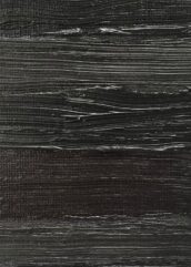
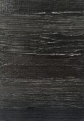
From 1954-67 Reinhardt made what he described as his ‘ultimate paintings’- Matt Black paintings, always 5ft x 5ft square. They have a barely discernible Greek cross centrally placed spanning the square canvas from top to bottom and left to right.

The canvas is divided into 9 equal squares including the cross.
When a viewer approaches one of his black paintings in a brightly lit ‘white cube’ gallery, they appear intensely and uniformly black. However, after a while when the eyes adjust to the blackness, the light begins to emerge out of the darkness and a cross or plus sign appears within the canvas. It was his intention to force the viewer to slow right down in front of his work, to stand still, and witness a suspension of time.
In ‘Abstract Painting’ 1963*4, the four corners of the canvas have a reddish-black tone, the horizontal bar of the cross a greenish-black tone, and the vertical bar of the cross a bluish-black tone.
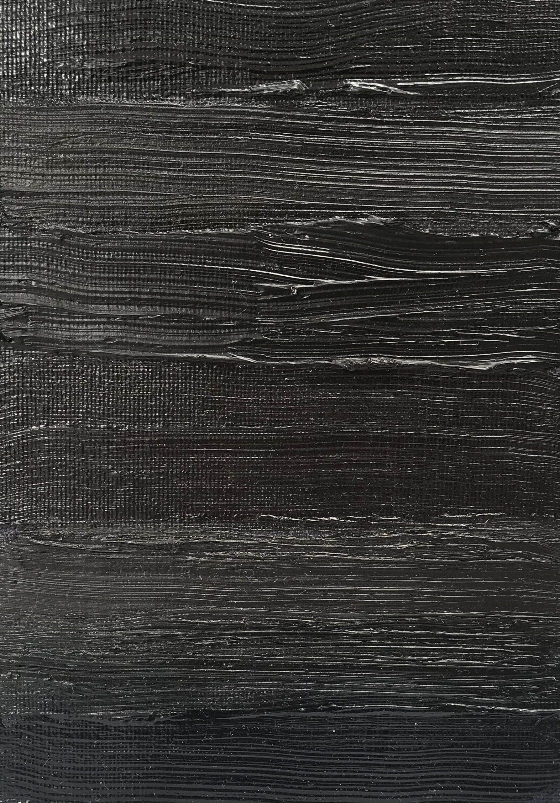
These paintings are virtually impossible to photograph. That’s the point. They have to be experienced firsthand as phenomena to become visible and not be understood as tiny reproductions, in a book or magazine. Reinhardt also wanted the black paintings to resist the marketing tool of photography, used for publicity purposes by the art market in the business of selling art. With their non-photogenic qualities, they are resistant to the mechanisms of consumer culture, very much in full swing by the 1950s in the USA.
In 1957 a former college friend from Columbia University, Thomas Merton, requested a black painting from Reinhardt. By now Merton was a Trappist monk and he wanted the painting as an aid to contemplative prayer. Merton described living with the painting as follows:
‘’An almost invisible cross on a black background as though immersed in darkness and trying to emerge from it…….you have to look hard to see the cross. One must turn away from everything else and concentrate on the picture as though peering through a window into the night……and to help one set aside trivial and useless images that wander into prayer and spoil it.’’
Reinhardt was a reductive radical and used black as his weapon of choice. He insisted on separating art from life and in erasing his canvas of any content other than art. He did not believe that Fine Art should be harnessed for political, social or self-expressive ends; it couldn’t transcend those things if it tried. He certainly did not think of art as a career to earn money. He wrote:
‘’Fine Art is not a means of earning a living or a way of living a life. Art that is a matter of life and death cannot be fine or free art. An artist who dedicates his life to art burdens his life with art and his art with life……Art is Art, Life is Life………More is Less and Less is More’’.
Reinhardt’s writings raise the idea of ‘negative theology’- a paradoxical way of intuiting the divine by saying what it is not.
In his manifesto of 1953, ‘Twelve Rules for a New Academy’*5 he affirms his idea of negation.
In it, he proposes painterly techniques necessary for transcendent purity within painting. He wanted all references to the external world deleted from his paintings. Figuration, symbolism, self-expression and hand gesture in mark-making of any kind were all to go. He went so far as to perfect a technique for distilling the black pigment from the oil binder in his paints, so as to render them perfectly matt. A sheen which is normally left by oil paint would have reflected a little light from the room in which the painting hung, and he wanted a painting that eradicated the light from the world external to his canvases.
Paraphrasing from his 12 Rules manifesto, pure painting would exhibit:
No texture, No brushwork, No drawing, No forms, No design, No colour, No light, No space, No time, No size or scale, No movement, No object.
Anna Barriball
Anna Barriball is a contemporary British artist, whose primary means of expression is frottage.
Frottage is like brass rubbing.
It is a technique for reproducing a textured relief-image by placing a thin sheet of paper over a flat-ish object and rubbing hard onto the paper over the object. This is done with any kind of dry drawing tool – ballpoint pen, pencil, crayon etc. An impression of the object’s markings and texture is imprinted and transferred onto the paper. The size of the chosen object and the size of the impression in frottage is by definition always the same – 1:1 scale.
Barriball uses a graphite pencil, so a graphite impression is produced. She could use any coloured pencil but chooses not to. Therefore black is a carefully considered part of the visual language she is using. Much of her work is black or near-black or grey, depending on the relative softness/hardness of the graphite in the pencil. Graphite leaves a sheen which picks up and reflects light from the raised texture and form of the rubbing. Hence the recording of texture and form in her works is in high resolution.
She selects subjects that are more often than not architectural. In particular, features where the boundaries between one space and another – inside and outside, are brought into focus. Thresholds – indicated by walls*5, doors*6 and windows (including stained glass)*7 are typical subjects.
All mark the boundary between one room and another or interior architectural space and the external world. While being at the same size as the original feature and in high resolution, the architectural features are at one remove. The architectural feature is present and absent at the same time, like a fossil or a husk.
These are thresholds and boundaries that one can only imagine passing through and beyond. In their ordinariness (we have all walked through doors or looked through windows) her subjects are surfaces which act as catalysts for the imagination and memory.
The fossil-like door cannot be walked through and the window with its total eclipse of any view creates a ‘blacked out’ or blind window. Perhaps in using graphite as a medium (a black medium), a negation of light and movement prevails, and these frottages imply entombment and/or exclusion.
It depends whether one is on the outside or the inside of these thresholds. One’s positioning as the viewer in relation to the subject is ambiguous. One could be on either side – inside or outside. If the architectural features were not black, the thought of them being impassable barriers would not be as strong.
*1 Hintmag.com, Anish-kapoor-black-vanta-black-trademark
*2 Nationalgallery.org.uk, Paulo-uccello-the-battle-of-san-romano
*3 Metmuseum
*4 MoMA
*5 Tate
*6 www.frithstreetgallery.com/artists/anna-barriball/works/p3
*7 www.frithstreetgallery.com/artists/anna/barriball/works
Further references: Black
Katharina Fritsch + rattenkonig 1993
Kasimir Malevich + Black Square 1915
Brice Marden + Sea Painting(s)
Louise Nevelson + Cascade 1964