Cadmium Red and Cadmium Yellow
There are three primary colours, red, yellow and blue. Red is the warmest primary of the three and blue is the coolest.
From these three primaries, all other colours can be mixed. These mixed colours are called secondary and tertiary colours.
Colours for Fine Art painting are made from pigment and these pigments are divided into two main groupings. Warm and cool.
Warm colours have a greater proportion of red in them, and cool colours have a greater proportion of blue in them.
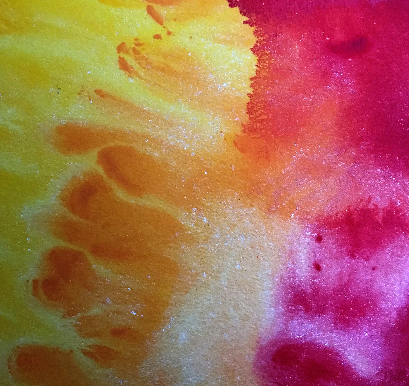
Both cadmium red and cadmium yellow are in the warm category and are particularly opaque and powerfully saturated pigments.
To compare and contrast different reds and yellows is a good way of observing the differences and to provide a definition of the various optical attributes.
A comparison can be observed between ‘warm’ cadmium red and ‘cool’ alizarin crimson. It’s the difference between a ripe tomato and a cherry. Cadmium red has more red in it and is therefore warmer than alizarin crimson, which contains more blue, giving it a purplish tinge.
Similarly, cadmium yellow is a warm yellow because in contains more red in it, and lemon yellow is cooler, because it contains a greater proportion of blue, resulting in a greenish tinge. An observable everyday comparison here would be the difference between an egg yolk with its orange tinge, and a freshly picked lemon fruit with its greenish tinge.
From an elemental, chemical perspective, cadmium is a zinc ore, and metallic cadmium was not discovered until 1817. The yellow pigment was discovered first. It was created by producing cadmium sulphide (cadmium yellow). Cadmium red was discovered later by heating cadmium sulphide in combination with selenium, the higher the temperature, the darker the red.
The properties of its chemistry make cadmium red and yellow the densest and most opaque red and yellow, with excellent ‘hiding’ properties, meaning over-painting qualities that cover up the colour underneath it. They are lightfast and exhibit superb permanence and are classified as ‘absolutely permanent’. The exception to these properties is for exterior use in murals.
Due to the relatively late discovery of these pigments they are not to be found in Old Master paintings.
Their influence on 19th century painting and particularly in the development of Impressionism and 20th century early Modernism is undeniable. It is the brilliance and opacity of these two primary colours and the success with which they can be over-painted that opened the door for new painterly techniques and new creative visions in late 19th and early 20th centuries.
Innovations in plein air painting – the recording of transient light effects painted directly and spontaneously outdoors in the landscape, and the saturated flat colour compositions of Modernism and Abstraction are synonymous with, and arguably facilitated by, the arrival of these two pigments.
Traditional chiascuro, the balance of light and shade in a picture and the management of tonal shadows in conjunction with perspective, gives way to pure colour juxtaposition. Applied direct from the tube in ‘all over’ compositions where background and foreground are equally significant, the Impressionists exploit the opacity and brilliance of cadmium pigments. Attention moves away from chiascuro. What becomes a priority is to discover what intensely coloured paint itself can do, outdoors, on a flat canvas, under the warm sun. Until this time painters had always worked indoors. The shadows still exist in Impressionism but they are made with pure colour. The opacity and intensely saturated pigmentation in the cadmiums is perfect for the flat ‘confrontational’ style of both Impressionism and Modernist Abstraction.
Notable examples of how the qualities of cadmium red have been used to great effect in the evolution towards Modernism can be seen in Claude Monet’s ‘Wild Poppies Near Argenteuil’ of 1873 *1 , and Henri Matisse’s ‘The Red Studio’, 1911 *2. Cadmium yellow used highly effectively in abstraction can be seen in Piet Mondrian’s ‘Composition with Blue and Yellow’, 1932 *3, and Ellsworth Kelly’s, ‘Black Over Yellow’, 2015 *4.
In ‘Wild Poppies, Near Argenteuil’ of 1873, only one quarter of Monet’s canvas at the bottom left is painted with poppies, but they dominate the canvas entirely and captivate the eye. The poppies grab the eye and demand attention with their intense colour. It is worth noting that they are painted within grass. Green is red’s complimentary on the colour wheel, and therefore intensifies the vibrancy of the poppies even more. They almost vibrate on the surface of the canvas. In any botanical catalogue of floral illustration these ‘poppies’ would be utterly unrecognisable. Poppies are wild flowers. Impressionism also appeared uncouth and wild to the Salon oriented art public of the day. In this painting they exist as splodges and dabs of red. This section of the canvas, when isolated from the more descriptive figuration throughout the rest of the canvas, is virtually abstract.
‘L’Atelier Rouge’ (The Red Studio), 1911, by Henri Matisse, is a huge painting for its day, measuring 162 x 219 cms. This is not easel painting.
A painting on that scale throughout history, would normally have been commissioned by the church or other wealthy patrons. Important stories illustrated from the Bible. Vast landscapes of classical antiquity and mythology. Battles on both land and sea commissioned by victorious dukes and princes. Full length portraits of wealthy landowners and their estates would all be big enough to envelop the viewer and induce awe and reverence.
In painting his modestly sized place of work, his studio, Matisse is being highly unconventional and confrontational.
In making the subject of the painting his workplace, he is placing the artist and his activity right at the centre of what he thinks should be significant in art – the act of painting itself and colour. It is a defiant counterpoint to history painting and the influence of patrons who commissioned it. It is a defiant painting because it asserts the belief that art should be independent of subject matter chosen by patrons.
‘The Red Studio’, shows paintings finished and unfinished hung up and leaning against the wall of his studio. There’s an empty frame. There’s a table with a still life arrangement on it. A chest of drawers, a chair, a grandfather clock and sculptures on work stands. The objects and artefacts in this interior have not been set up as one might expect to see in a still life, even though there’s one in the painting. They all look quite ‘unarranged’, as if Matisse had just walked in one morning and decided to paint the studio as he found it. Like many studios it’s a bit messy.
What is astonishing and again unconventional is the background. The least interesting thing, the walls and floor of an artist’s studio, are in Matisses’s version, all cadmium red. The tradition of a painting being a window onto the illusion of another world is amended. The three dimensions of his studio become a flattened all over design. The surface plane of the canvas itself is emphasised, not the studio interior’s three dimensions. All of the disparate elements are brought into unity within an expanse of red that covers the whole huge canvas to its four edges. The recording of light in a room has been abandoned in favour of a saturated red surface. It envelops the viewer in a field of bright colour, not a field of poppies, but an enormous field of pure cadmium red.
It is hard not to see this painting as a precursor and inspiration to the large scale works of colour field painting and abstraction formulated by the New York School in the 1950’s.
‘Composition with Blue and Yellow’, 1932, by Piet Mondrian is a painting where three dimensionality, representation, and curved lines have been eliminated. By the time of his evolution into an abstract painter, he particularly disliked the colour green, because it was redolent of nature. Mondrian was striving for an art that transcended the observable natural world, and there are no straight lines in nature.
The paintings of his mature style, which he termed as ‘Neo-Plasticism’, were painted exclusively in the primary colours of red, yellow and blue, on a ground of white, and between horizontal and vertical black lines. He chose a reduced palette and the ‘neutrals’ of white and black to achieve absolute purity in art. Red, yellow, and blue cannot be produced by mixing any other colours together; so in Mondrian’s mind they are pure.
In an essay on Neo-Plasticism he wrote ‘’ As a representation of the human mind………….this new plastic idea will ignore the particulars of appearance, that is to say, natural form and colour……………it should find expression in the abstraction of form and colour…………..in the straight line and the clearly defined primary colour’’.
It is significant that his works of this period are seldom titled, except for what they are literally, a composition made with primary colours. They are reduced to what the essence of painting really is, paint on canvas. Even titles become irrelevant. They are not narrative paintings with a back-story and do not embody or try to project symbolic meaning, so persisting with titles would be misleading, even pointless.
They are not a symbol of something else; they have a presence all their own, with their own distinct visual language. ‘Composition with Blue and Yellow’, 1932, is not a serene view onto a perfectly serene lake at sunset. But this canvas itself is perfectly serene.
It produces a calming effect in the viewer and slows one down in the looking. His works communicate using a universal visual language of straight line and primary colour.
Although the paintings are made by Mondrian, they are not about him. The painted colour is laid down as a flat layer without the usual ‘signature’ brush stroke of an individual. This adds to their universality.
In ‘Black Over Yellow’, 2015, Ellsworth Kelly pushes the concept of non representation to its limit. The attention of a viewer is directed to the contemplation of colour and concrete form exclusively. The ‘object quality’ of painting (as opposed to its capacity for illusionism and perspective) is given absolute priority.
One way Kelly achieves this is to break away from the rectangular format of most canvases. Conventionally, canvases are rectangles to enhance the idea of a view through a window onto a view (the scene painted by the artist).
In making two distinct canvases of different sizes in ‘Black Over Yellow’, and by butting them up against each other, the window effect is avoided, and the paint is given a near sculptural/physical quality. The ‘Plasticism’ that Mondrian envisaged is fully realised.
Black is given physicality above Yellow light. In terms of the physical sciences, black is not a colour because it absorbs all light from the colour spectrum and reflects none back to the eye.
Kelly is stacking black on top of yellow. He is stacking a void on top of light. The piece is installed so that it is 5cms from the wall at the back. This asserts their object quality and makes them appear to float.
In its reductive approach (there are no drawn lines) and rejection of the single rectangle, his works are an ultimate challenge to representational painting.
However, ‘Black Over Yellow’, embodies an essence of the Sublime which so inspired the Romantic artists of the 19th century.
William Wordsworth, best loved of English Romantic poets, was inspired by the light from golden daffodils in his most famous poem ‘I Wandered Lonely as a Cloud’, of 1804.
In his shaped canvases of one bold yellow and a black, it effectively becomes a field of dark over light. This in turn evokes ideas of the Sublime, but Kelly is not depicting it as a scene, it is with us in the gallery.
‘Black Over Yellow’, 2015 was painted in the year of Ellsworth Kelly’s death at the age of 92.
References
Ref *1 www.claude-monet.com/the-poppy-field.jsp
Ref *2 www.henrimatisse.org/the-red-studio.jsp
Ref *3 www. piet mondrian composition with blue and yellow 1932/philadelphia museum
Ref *4 http://news.artnet.com/exhibitions/see-ellsworth-kelly-last-paintings-mathew-marks-941609
Other references
Adolph Gottlieb ‘Cadmium Red Above Black’1959
Barnet Newman ‘Who’s Afraid of Red, Yellow and Blue?’1966
Callum Innes ‘ Exposed Painting – Cadmium Red’ 2001
Piet Mondrian ‘Broadway Boogie – Woogie’ 1943
Callum Innes ‘Exposed Painting – Cadmium Yellow’ 2016
Ellsworth Kelly ‘Yellow with Black and White’ 2013