Palette table by Richard Wathen
(Picture above: Floating in still water, 2019)
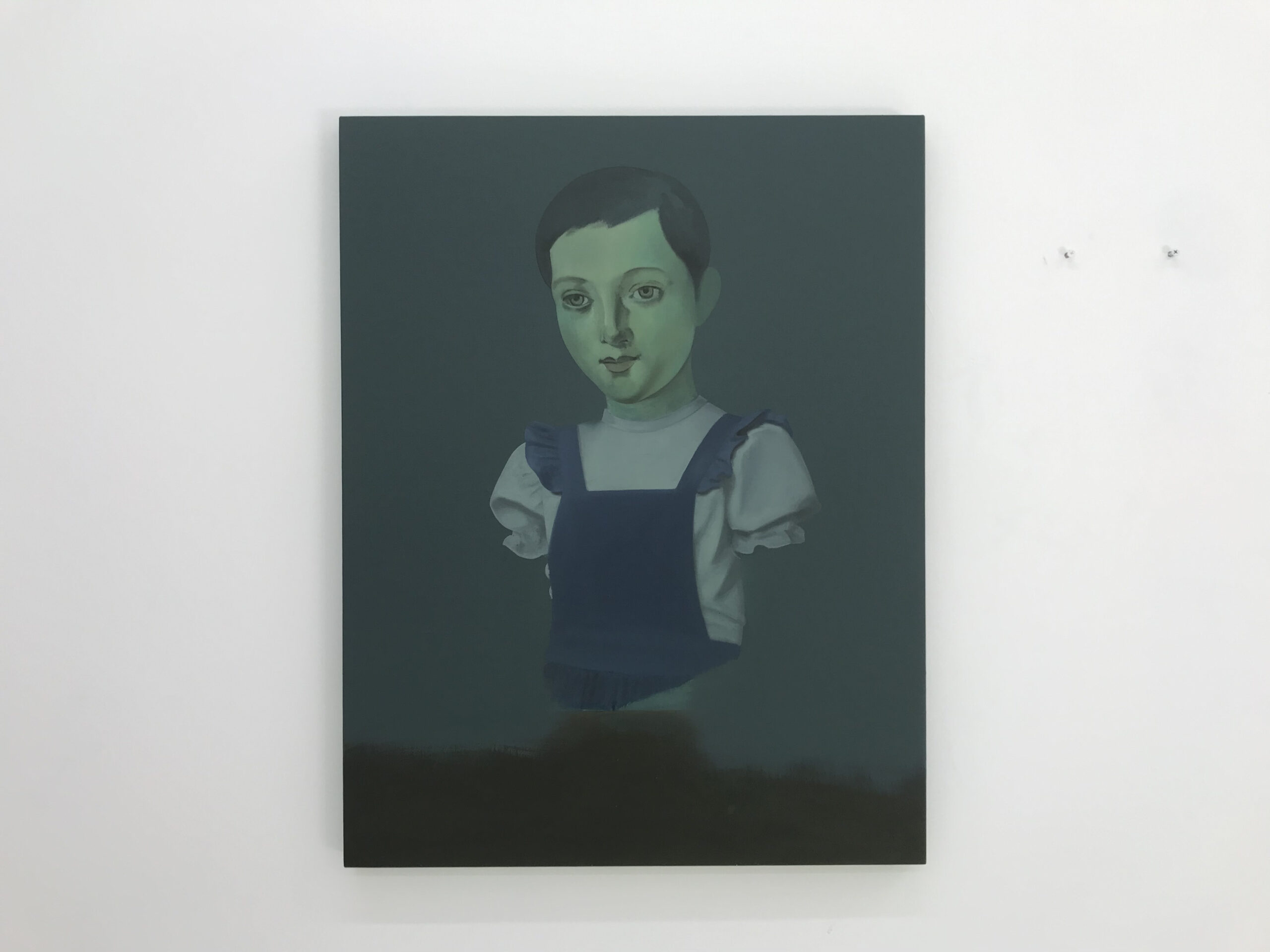
Some years ago, I built a palette table on wheels, which has followed me from studio to studio. It has a large glass top and the white table can be seen through enabling me to mix colours cleanly. I work on white gesso primed linen so the white tabletop mirrors the ground I paint on. Colours are arranged around the palette but there is no set formation, it varies from one painting to another. The works generally consist of a fictional portrait set against a background of blended or flat colour similar in feel to those used by retro Portrait photographers. The Background is made up of thinly applied layers and is usually ‘completed’ before I start the figures.
The way I choose colour is quite intuitive. I am aware of ideas around colour theory but I prefer to select colours I am drawn to because of their intricacies, rather than having a set of colours I use for every painting. I often find I return to colours that are greyed out and pale, feeling less sure with strong colours. Occasionally I convince myself it’s ok! I recently made a small painting where the background was made using Permanent Greenlight with only a hint of titanium white and loved the result.
I am attracted to opaque rich colours such as Cobalt Turquoise and Cobalt Chromite Green and I particularly enjoy these alongside other similar transparent colours like Winsor Green (Phthalo) and Viridian. I will often use transparent colours while blending the backgrounds to create a mist of colours.
I often respond to the ground colour when making colour decisions for the figures. I am increasingly interested in working with colours that evoke a feeling of illness or disquiet. I like using Jaune Brilliant mixed with Terre Verte and enjoy mixing the colours between colours ( pinkish greenish-grey etc) hopefully echoing the uncertainty and slowness I want the paintings to convey.
Although my work is representational or can be misconstrued as employing traditional oil painting techniques, my preoccupation lies with mood or atmosphere as much as questions of figuration. I find colours such as Winsor Green (Yellow Shade), Perylene Black, Purple Lake and Ultramarine Violet evoke ideas of nostalgia and memory, although that is more of an afterthought rather than a reason for selecting these colours.
In my most recent paintings, I have been allowing larger areas of the paintings to remain open with the figures occupying edges or looking unfinished. I have also felt more confident in trying new colours and not allowed the ‘tried and tested’ formulas to take over. However, I still can’t use Red!
I am very excited to be showing these new paintings in a solo show at Mostyn Gallery later this year and am enjoying not only thinking about colour in individual paintings but how they inform one another.
Richard Wathen 2020